Tips On Designing Your Wedding Invitations
We welcome Guest Blogger, Bryan Passanisi, with Shutterfly, today for some great tips on wedding invitation design! Shutterfly has some great budget-friendly resources for those of you on the hunt for wedding invitations! I first became familiar with Shutterfly from my sister who has been using this company for creating photo books of her children each year. I'm so jealous because I have yet to finish mine and Jagger is almost 4! I have a lot of catching up to do! Be sure to check them out! They have a lot of really awesome and creative ways to add details to your wedding OR make great gifts for your family.

Things to Think About When Designing Wedding Invitations
Invitations are one of the most important parts of preparing for a wedding. Not only do they notify your guests of the marriage and convey important information like time and place, they also set the tone for the rest of the wedding. It’s important to have a good first impression, but there are so many options out there for wedding invitation design that choosing the right style can be difficult. Here are a few tips that can help guide you as you create the perfect invitation.
Consider the Ceremony
First of all, make sure that the tone you pick for your invitation reflects the rest of the wedding. Are you hoping to have a fun, casual celebration? Or do you want a formal tuxedo and ballgown affair? More formal invitations look very different from more casual ones. The difference can extend from wording choices to the paper used—formal invitations tend to be on thicker, more expensive paper than informal ones.

Color Choices
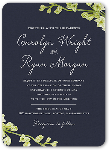
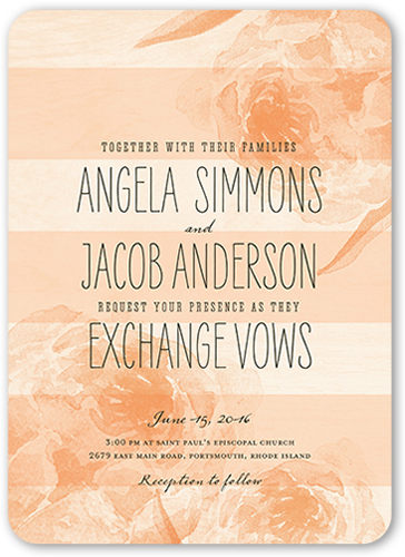
Consider choices such as the colors and design of your invitation. Formal invitations are typically more limited in their palette; you may wish to stick with traditional neutrals such as cream, black, or gold. One color might be used as an accent or highlight. Less formal invitations, though, have a lot more latitude when it comes to the use of color—you can choose vibrant blues, bright yellows, or whatever combinations will match with your wedding theme. Try not to include too many shades, though, or else the invitation can come across as too loud; stick with a set of related hues or go for two or three contrasting shades.
Creative Shapes
If you really want to get creative, then experiment with the shape of your invites. Traditional invitations are rectangular, although elegant quatrefoils may be acceptable. If you’re having a less formal wedding, though, feel free to experiment with rounded corners, scalloped edge, or even circular or square invitations that reflect your personality.
Font Options
The font is important too. You’ll probably want some sort of script for a formal invitation, whereas nontraditional fun fonts such as Comic Sans or Informal Roman are a great choice for casual invites. If you’re having trouble choosing, a basic font like Times New Roman, Garamond, or Verdana can work well, although serif fonts usually have a bit more formality (and in some cases personality) than sans-serif ones do. You might even consider doing an invitation with mixed fonts, using script for the couple’s names and plainer fonts for the time and place, although it’s important not to make these two fonts drastically different or the invitation will look sloppy. Whatever font you choose, be absolutely certain that it’s legible at every size; some of the fancier and les traditional choices can be hard to read when they’re small and the last thing you want is an invitation that nobody understands.

Picture Perfect
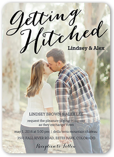
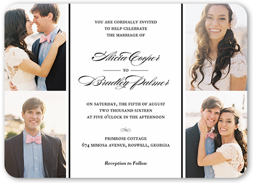
Do you want to include a photo? Not all wedding invitations include pictures, but adding a picture of the happy couple gives you more opportunity to let your personality shine through. Black and white pictures tend to be more elegant and classic, while colorful photographs look more approachable and realistic. Make sure that you have a number of pictures of the two of you to choose from; this will help you find a picture where you both look your best. Try to find photographs that match the colors of the invitation so that the colors don’t clash.

Backgrounds
Also, determine how much the setting of the photograph matters to you; if all you’re looking for is a shot of the couple’s faces then the background won’t be very important. For other pictures, though, the background is an important component in the design of the invitation. You can choose a traditional setting like a garden, mountain, or beach, or you can go for modern city shots. If you really want to get creative, take your photos in unorthodox locations like art museums, graffiti-covered walls, or amusement parks. You can even choose to include night or evening photos rather than typical daytime ones.
Arrangement
Finally, determine how many photos you want to include and where you’d like to put them. If you have a lot of pictures that you like, you can choose to create a collage or have a single large photos with smaller insets. You can also pick a single classic photo and put it in a frame on your invitation. Another great idea is to take a single photo, blow it up to fill the whole page, and then use it as a background for the text.

Making it Great
Other considerations you should take into account while designing an invitation include the wedding theme (if you’re having a themed wedding), the wording of the invitation (formal or casual) and whether you want to include extras such as foil stamping, ribbons, or rhinestones. Whatever you end up choosing, make sure that the wedding invitation reflects the style of the ceremony, the personalities of the bride and groom, and—above all else—the love that you have for each other.
Bryan Passanisi is online marketer and writer living in Redwood City, CA. He graduated from The University of San Francisco with his Bachelor’s Degree in Marketing. Bryan has managed a popular wedding blog and has created viral content. He currently is a blogger for Shutterfly.
All images provided by Bryan Passanisi, Shutterfly
